Reimagining the Claims Experience
Designing a High-Stress Service Journey with Systems Thinking, Clarity, and Care
Role
Sole Product designer
Areas
Care-Centered Design
Service Design
Systems Thinking
Multiple User Profiles
Trust & Transparency
Moments of Vulnerability
Year
Jun - Aug 2021
.png)
NEW Claim experience, launched Sep 2021
PROBLEM STATEMENT
OBJECTIVES
-
Customers struggle to initiate and track claims online, relying heavily on manual processes.
-
Support agents spend significant time handling claim inquiries, driving up operational costs.
-
The seasonal nature of the business leaves a narrow window to deliver meaningful impact.
-
Enable customers to accurately and confidently file claims independently.
-
Reduce support tickets per claim, lowering customer support costs.
-
Move quickly from strategy to execution to maximize impact during peak season.
IMPACT
-
31% decrease in support tickets per claim.
-
40% savings ($52,000/yr) on customer support cost.
-
New design QA process established.
-
Alternative user testing method introduced.
Background
In the storage and transportation industry, damage or loss during transit is a common challenge. When issues occur, customers—already frustrated—must navigate a complicated claims process: locating a claim form in the Help Center, completing it manually, emailing photos, and then waiting up to four weeks for a resolution. During this time, many customers reach out to support agents for assistance or simply for status updates.
Current claim process

1 - find claim form at Help Center
7.png)
2 - fill out the form

3 - send photos through email and wait
PROBLEM DISCOVERED
As our business expanded in 2020, confusion and uncertainty within the claims experience surfaced more clearly, with each claim generating an average of 5 customer support tickets.
Research
To better understand the problem, I analyzed both quantitative and qualitative data. Quantitative data provided a clear view of the scale of the issue and the range of problem categories, while qualitative insights helped me understand customer needs, motivations, and specific usability challenges.


File a new claim
Check on the status of an existing claim
Submit photos
Claims inquiry type - Zendesk
Total time spent by ticket type - Zendesk
In the past six months, claim-related inquiries accounted for 26% of total support time: 56% focused on filing a new claim, 30% on submitting photos, and 14% on checking claim status.
Through a review of 50+ support tickets and 30+ FullStory recordings, I found that customers often lacked clarity on where to start and felt anxious while waiting for updates. The lack of visibility and reassurance drove repeated outreach, while email-based photo submission added unnecessary friction for both customers and support teams.

Review claims tickets
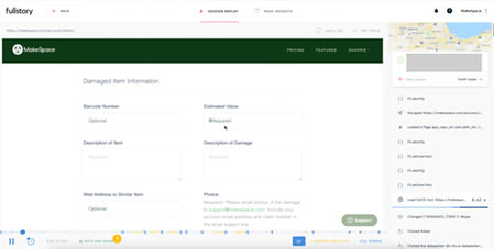
Watch FullStory recordings
Note: contents are blurred for confidentiality
Customer Lisa
“Some of the furnitures are broken. What should I do now? Is there any process where I can get compensated?”
Customer Maria
"I just submitted 2 claims. And I also sent you several emails with the photos (the photos are too large to be included in one email). Can you please let me know if you get everything??"
Customer John
"I don’t know if I ever got a follow up email. I just wanted a status update on my claim."
Synthesis
Over the past four years, claim-related tickets accounted for nearly 30% of support time, costing $120,600 annually and far exceeding all other support categories.
BUSINESS
On average, customers contacted support five times to file a single claim and receive a resolution.
CUSTOMERS
PROBLEM STATEMENT
Customers struggle to initiate and track claims online, facing manual processes and limited clarity throughout the experience.
Strategy
The goal was to enable confident, self-service claim filing while reducing support volume and customer support costs.
To ensure seamless integration, I approached the problem at three levels: understanding the overall customer journey, redesigning the end-to-end claims experience within that context, and addressing implementation details to ensure feasibility.

Process strategy
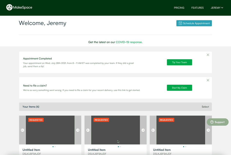
01 MAKESPACE USER JOURNEY
Mapping the full MakeSpace user journey revealed the Dashboard as the system’s central touchpoint. Anchoring claim initiation and tracking there ensured continuity with customers’ existing workflows.

MakeSpace user journey
02 END-TO-END CLAIMS EXPERIENCE
Analysis of support tickets and workflows revealed three essential stages in the claims journey: initiate, file, and track. The redesigned experience anchors all three steps in the Dashboard to provide clarity and predictability.

End-to-end claims experience
03 IMPLEMENTATION DETAILS
CHALLENGE
As peak delivery season approached, claims were expected to spike—leaving a tight window to deliver a high-impact solution.
To move quickly and stay agile, I created a three-phase implementation plan based on effort and impact. We prioritized releasing the initiate and track experiences first, while I continued designing and refining the claim form experience.

Design
PHASE 1 INITIATE AND TRACK EXPERIENCE
Design Principles
Harmony and Visibility

Initiate

Track
CHALLENGE
However, claims remain a sensitive and often unpleasant topic. How might we limit their exposure to general customers?
To avoid unnecessary anxiety for unaffected customers, my strategy was to target the right audience at the right time—surfacing the feature only after delivery completion and only within the two-week eligibility window.
PHASE 2 FORM EXPERIENCE
While implementation began on the initiate and track experiences, I continued designing the claim form. I explored multiple approaches, including multi-step and single-page forms, and ultimately chose a single-page experience for its flexibility and ease of modification.

Multi-step form experience

Single form experience
Single form experience - wireframe

DESIGN CHALLENGE
In a high-stress moment, how might we make a complex, dynamic form feel clear and manageable?
After consulting the Design System designer, I grouped content into white containers on a gray background to reduce visual noise and improve clarity. This approach aligns with our design system and creates clearer visual hierarchy.
Visual grouping
4%201.png)

Before
After
DESIGN CHALLENGE
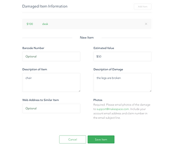
Knowing that customers may not recall every item upfront—particularly when under stress—how might we encourage a complete, one-time submission?
Research revealed that many customers submitted multiple claim forms for different items, creating additional work for support teams to reconcile data and causing confusion in follow-up communication.
I addressed this issue from three angles:
-
Usability: I made the “Add Item” action more prominent and placed it at a more intuitive point in the flow.
-
Content: Instead of showing instructions only at the beginning—where they were often skipped—I moved guidance closer to the “Add Item” CTA, making it more contextual and relevant.
-
Interaction: The previous add/edit interaction was complex and confusing. I simplified it into an accordion-based pattern, making it easier to add, review, and edit items within a single form.
Usability


Before
After
Content


Before
After
Interaction

Before
After
User Testing
Although user testing was my initial recommendation, constraints around timing and infrastructure required a pragmatic approach. I aligned with the team to prioritize release ahead of peak season, recognizing the immediate value of the new functionality.
To manage risk, I established a feedback strategy grounded in real user behavior—combining insights from customer-facing teams with post-launch analysis of session recordings and support tickets. This ensured we could respond quickly and responsibly to emerging issues.
Review with Stakeholders
Chalmers, Director of Claims
“Customers often struggle with getting the item barcode. Now it’s the first question, it might put people off.”
Sean, Senior Manager of Customer Support
“Customers feel upset when they don’t receive the money they claimed for. How can we help them understand our policy?”
Feedback from Claims and Customer Support highlighted how easily frustration could build during the claims process—from early friction in the form to disappointment around payout expectations. By reordering questions to reduce cognitive load and repositioning policy information to better set expectations, the redesigned experience supported clarity, trust, and emotional ease.
Designing for Emotional Ease


Simple
Granular
Complex
Before
After
Setting the Right Expectations

Before

After
Implementation
As part of design QA, I worked with engineers to ensure the form was accessible and intuitive—confirming that interactive elements like radio buttons and their labels behaved consistently and that image uploads followed the same accessible interaction patterns.
Form accessibility


Design QA
Post Launch
Support Tickets per Claim
-31%
Customer Support Cost
-40%
Annual Operational Savings
~$52,000
Despite QA challenges, the experience launched ahead of the July 2021 delivery season with positive results.
After launch, I analyzed FullStory recordings to evaluate real-world usage. Customers were able to initiate and track claims more easily through the Dashboard, but the form surfaced several usability issues.
Customers frequently struggled with the value field due to strict validation paired with unclear guidance. I addressed this by adding constraints that guided input and reduced error states. Additionally, some customers continued submitting multiple claims for different items, indicating opportunities to improve copy clarity, CTA visibility, and the underlying mental model for adding multiple items in one claim.
Value field usability

Struggle with the value field - FullStory session

Follow-up iteration
Item experience
-7%201.png)
Implemented version

Follow-up iteration
The follow-up designs are currently being implemented, and early feedback from stakeholders has been positive.
